
Navigation Card For Subpage Links
The Navigation Card's orange design is used on landing pages to link to subpages of the same site.
Design

Additional Information
Usage
Use on landing pages.
Image Size
Minimum Size: 694px wide (or 2x: 1388px wide)
Best Practices
- All images on a page must be the same size or proportions.
- Only use this navigation component with short headlines. For longer headlines, use a
Character Limit Recommendations
40 characters max. Up to two lines of header text.
Notes
This widget has an alternate design that is used to add .
The widget is in the Gov Cards folder.
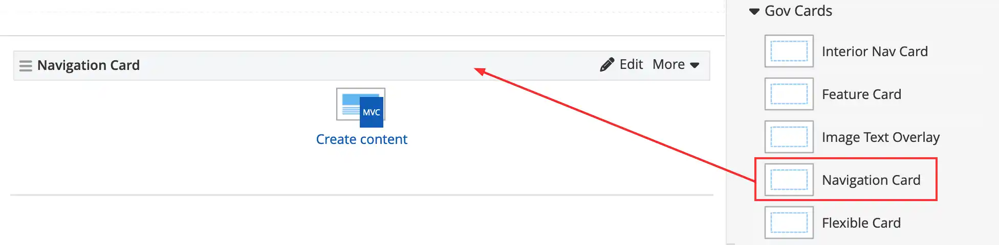
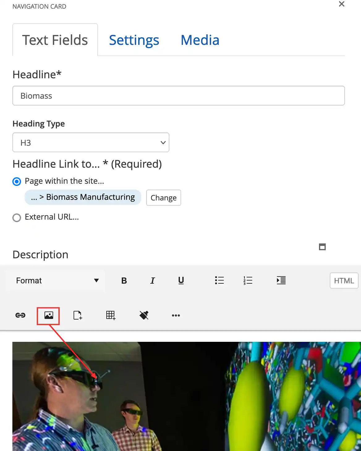
Text Fields tab:
- Add the Headline
- Select the Heading Type (h1-h6)
- Add the Headline Link
- Add an image in the Description field
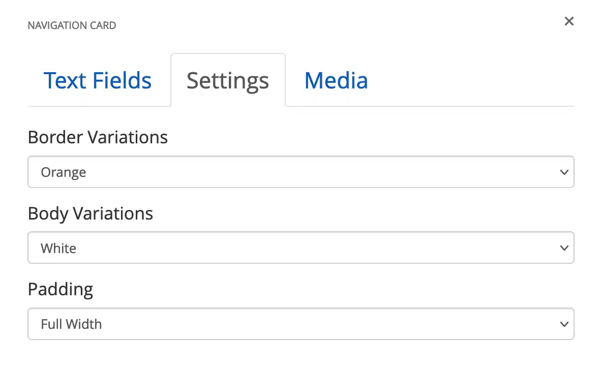
On the Settings tab, make these selections:
- Border Variations: Orange
- Body Variations: White
- Padding: Full Width.
Share

Last Updated Nov. 17, 2026