
This site contains technical information about Sitefinity widgets and content types.
Heroes/Banners
News Feature

Horizontal feature with a large image/video on one side and a blue box with a headline, summary, and link on the other.
Use on home pages.
Gov Heroes/Banners
Plain Image Hero

Large image for desktop with smaller image for mobile.
Gov Heroes/Banners
Video Hero
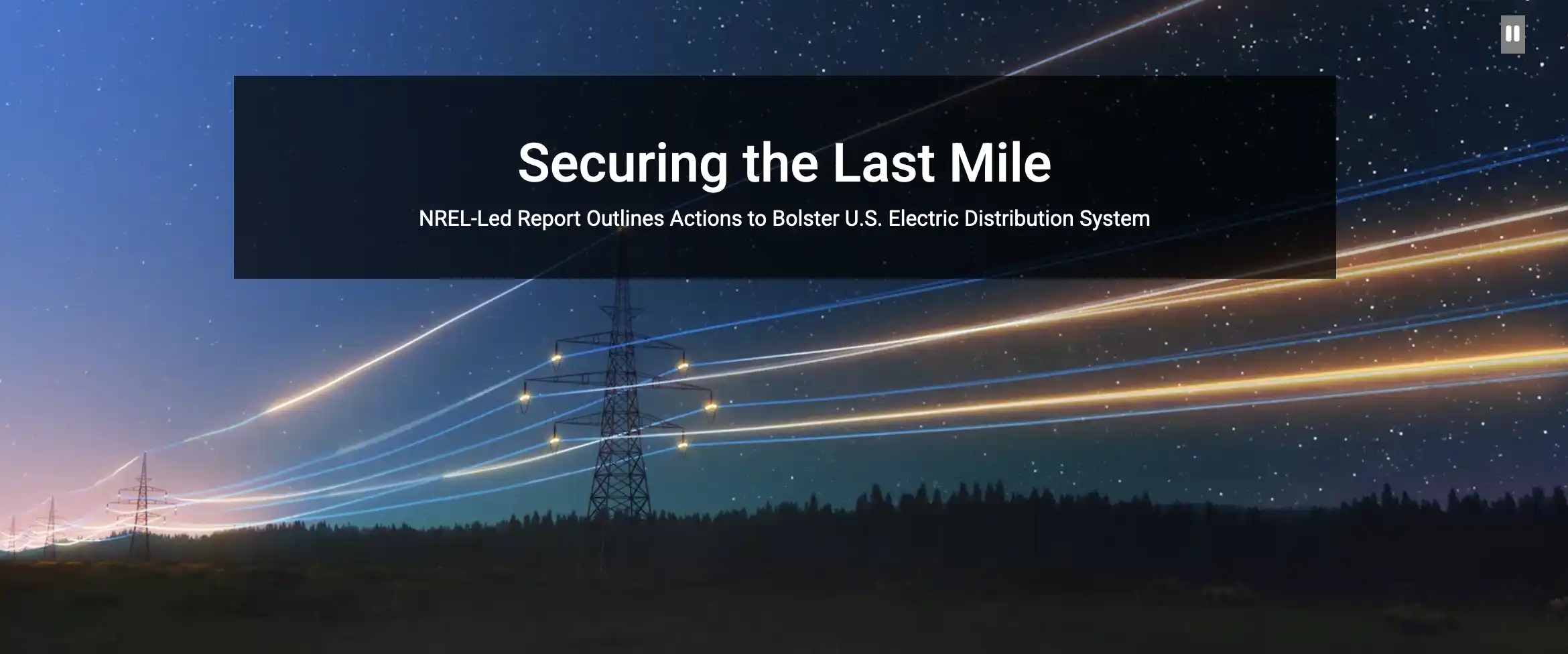
Video loop with text overlay.
Use on annual reports.
Gov Heroes/Banners
Parallax Hero
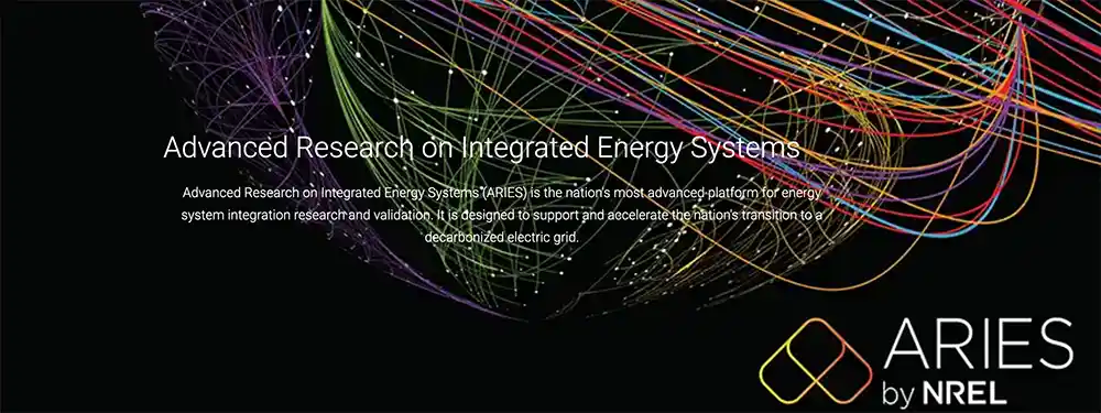
A large image and text overlay with an immersive scrolling effect.
Use on annual reports.
Gov Heroes/Banners
Primary Content
Bio Photo

Contact information and leadership staff listings.
Gov Misc.
News Widget
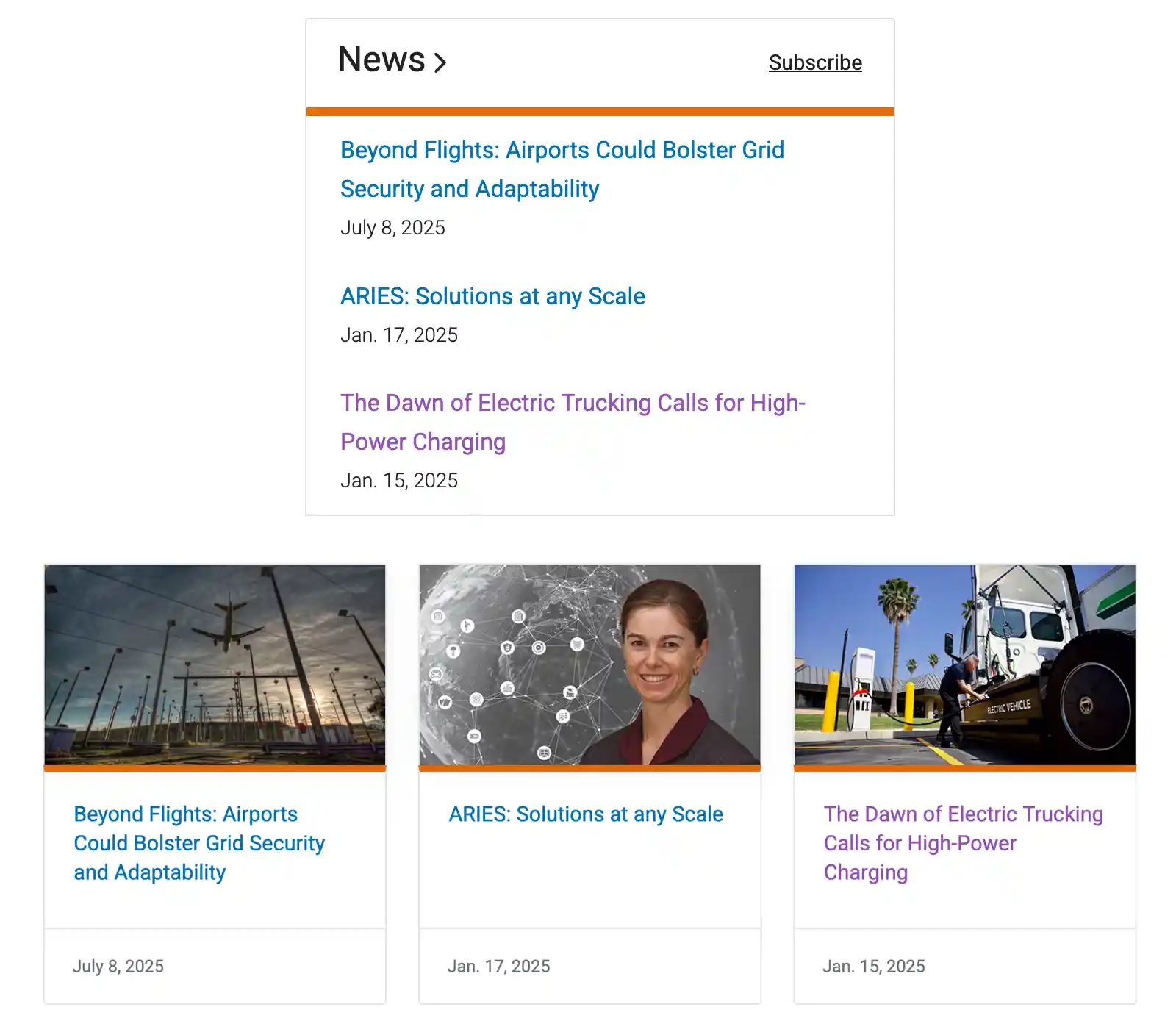
DIsplay a list of tagged news stories.
Use on landing pages.
Content
Image Responsive
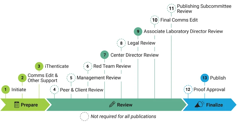
Show different versions of an image for mobile and desktop.
Content
Featured Content
Content Block Background
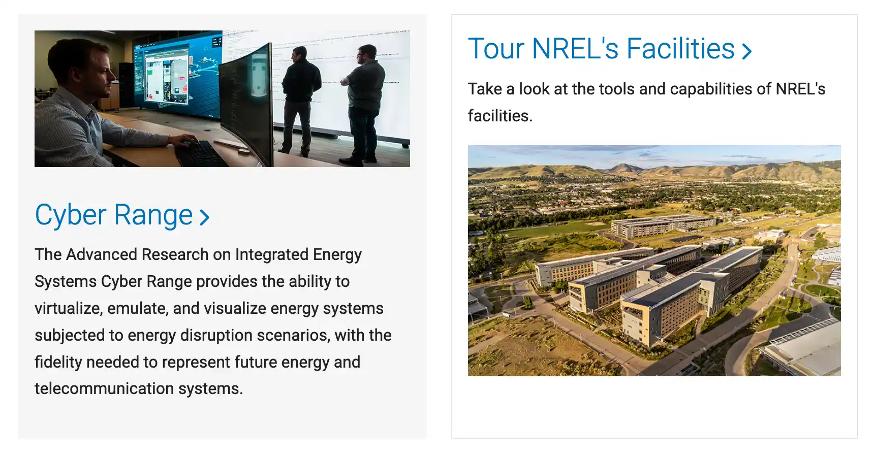
A gray or white block used to highlight content.
Gov Content
Feature Card
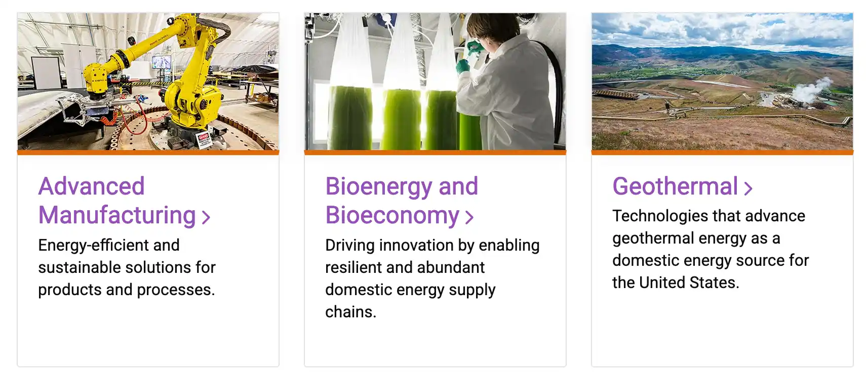
Use this card when both the header and text are below the media.
Gov Cards
Flexible Card
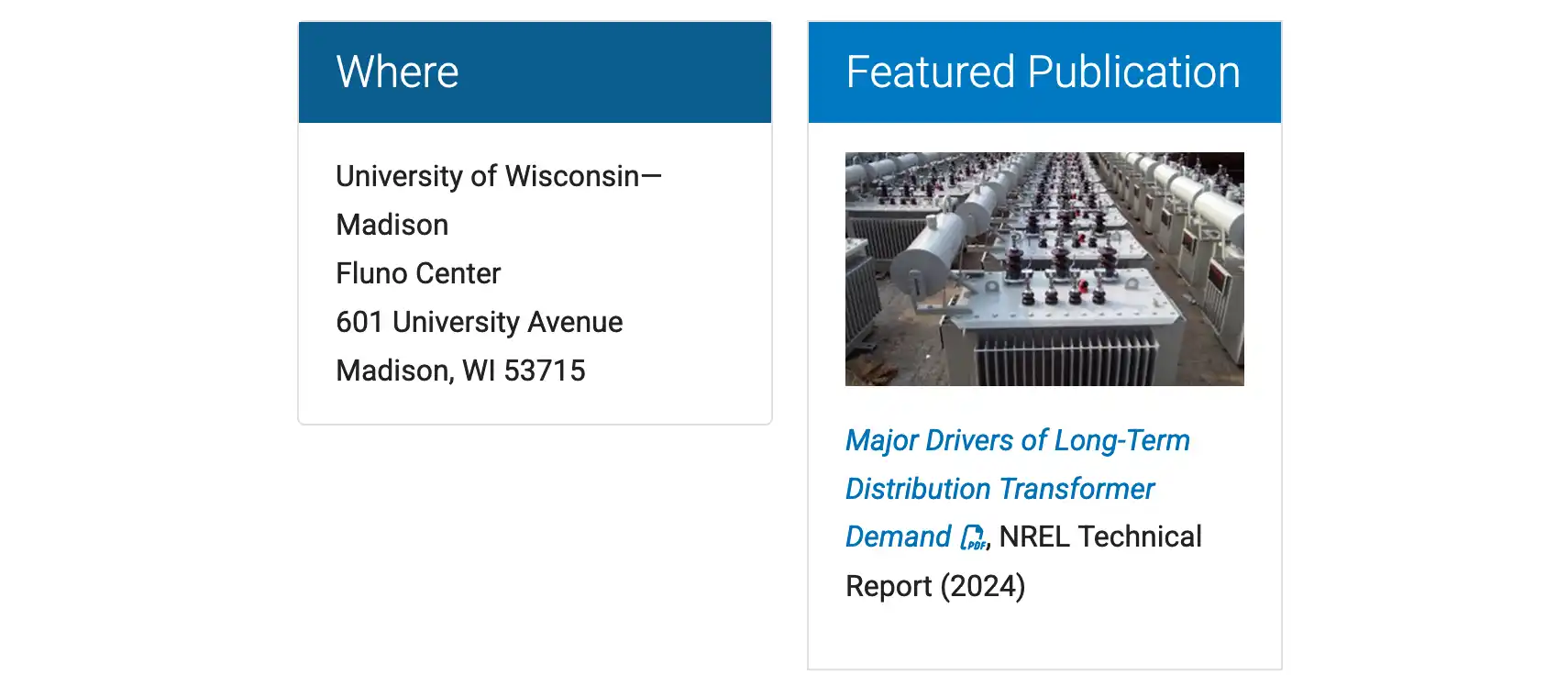
A bordered box with a blue top.
Gov Cards
Icon Color Box
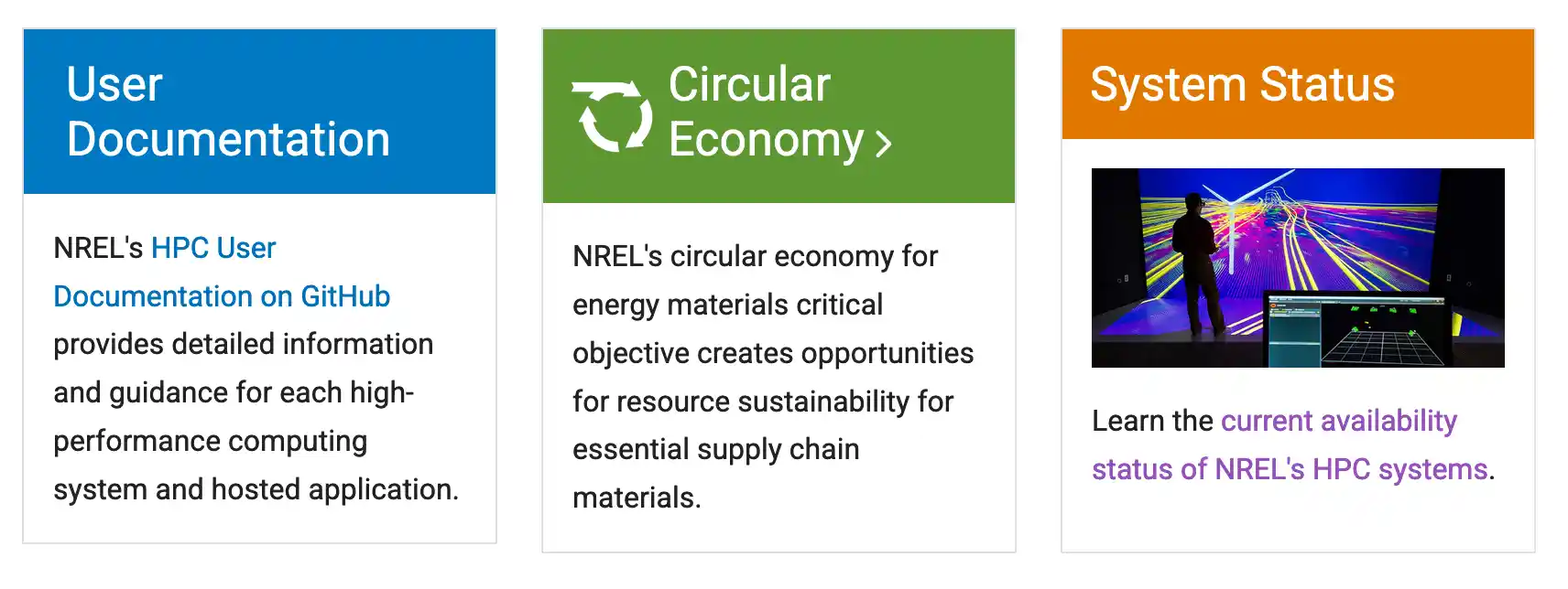
An outlined box with a solid color header and an optional icon in front of the headline.
Gov Misc
Icon Card
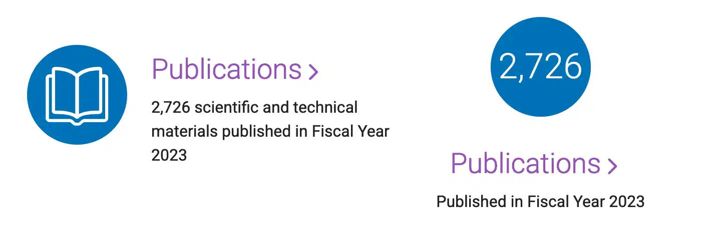
A circular icon, a headline, and a description.
Gov Cards
Card
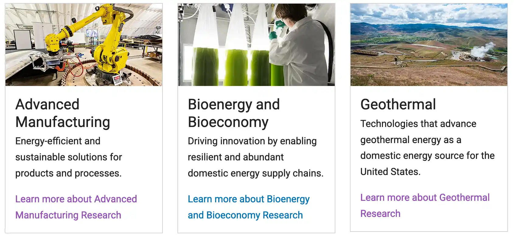
An outlined box with an image at the top along with a header, text, and link below.
Content
Animated Stats

A description and a number that is dynamically counted to as the window is loaded.
Gov Misc
Testimonials
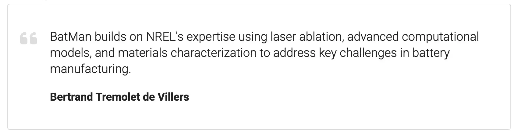
Box with a quote and the author.
Gov Misc
Scroll Text Callout
Scrolling text over a background image.
Use on annual reports.
Gov Image/CTA
Notification Banner

A custom message to notify your visitors about an important update.
Use on home pages.
Gov Heroes/Banners
Image Video Callout
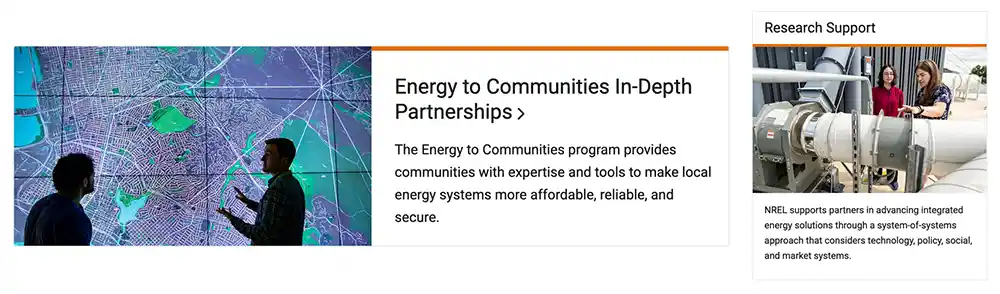
A vertical or horizontal call out block.
Gov Image/CTA
Full Width Image/Video Callout
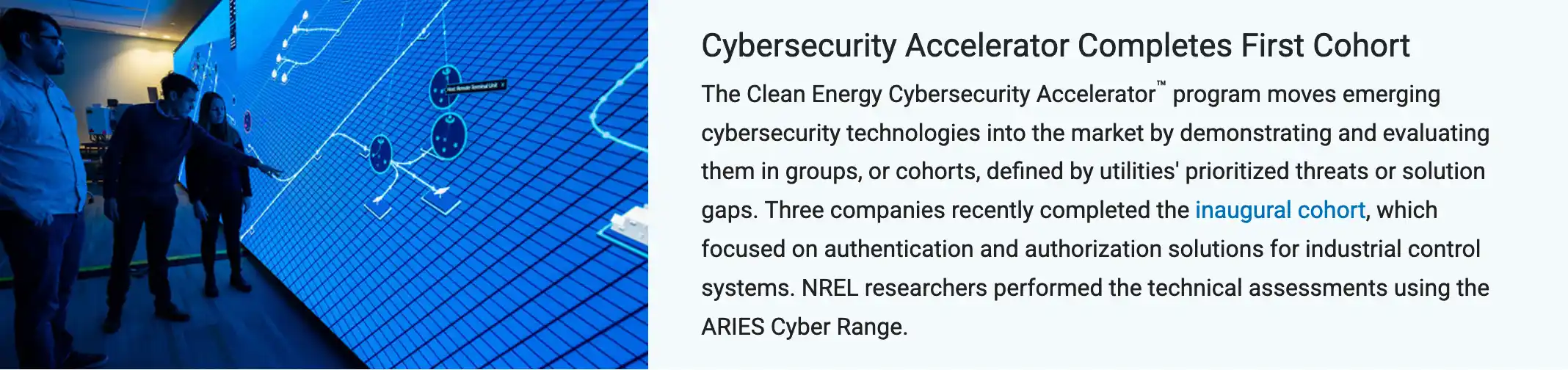
Horizontal feature with an image/video on one side and a headline and summary on the other.
Use on annual reports.
Gov Image/CTA
Navigation Blocks
Navigation Card For Subpage Links

Use to link to subpages on the same site.
Use on landing pages.
Gov Cards
Horizontal Navigation Row
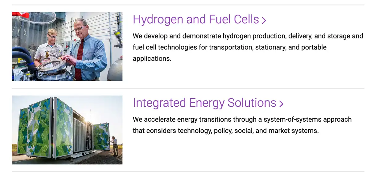
Use a horizontal desktop layout for blocks with long headlines and text.
Use on landing pages.
Manual Layout (not a module)
Interior Nav Card
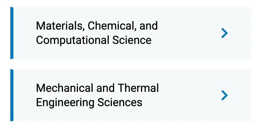
Use to link to subpages on the same site.
Use on home pages.
Gov Cards
Videos
Navigation Card For Video Playlists
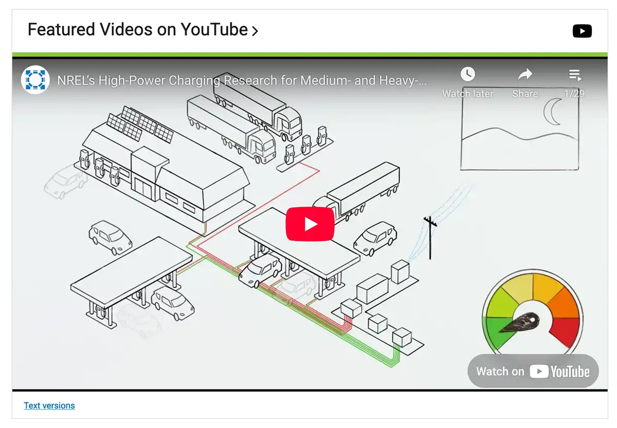
Showcase a YouTube Playlist.
Use on home pages.
Gov Cards
Video Hero
Video loop with text overlay.
Use on annual reports and enhanced news feature stories.
Gov Heroes/Banners
Transcribed Video
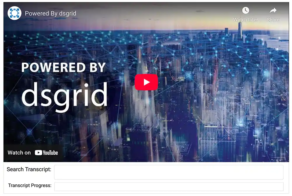
A video with a searchable transcript.
Use for text versions.
Gov Misc
Content Organization
Accordions
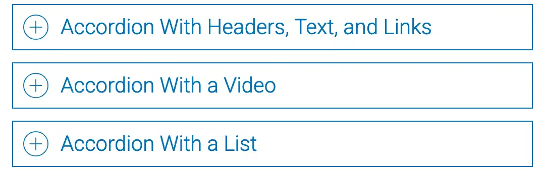
A list of headers that can be clicked to hide or reveal content.
Gov Content
Tabbed Content
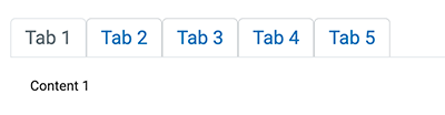
Displays content that is organized under clickable, horizontal tabs.
Gov Content
Carousels
Image Carousel
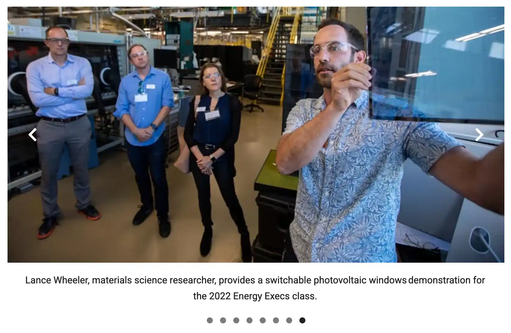
Display multiple images with or without captions.
Gov Cards
Image + Text Carousel
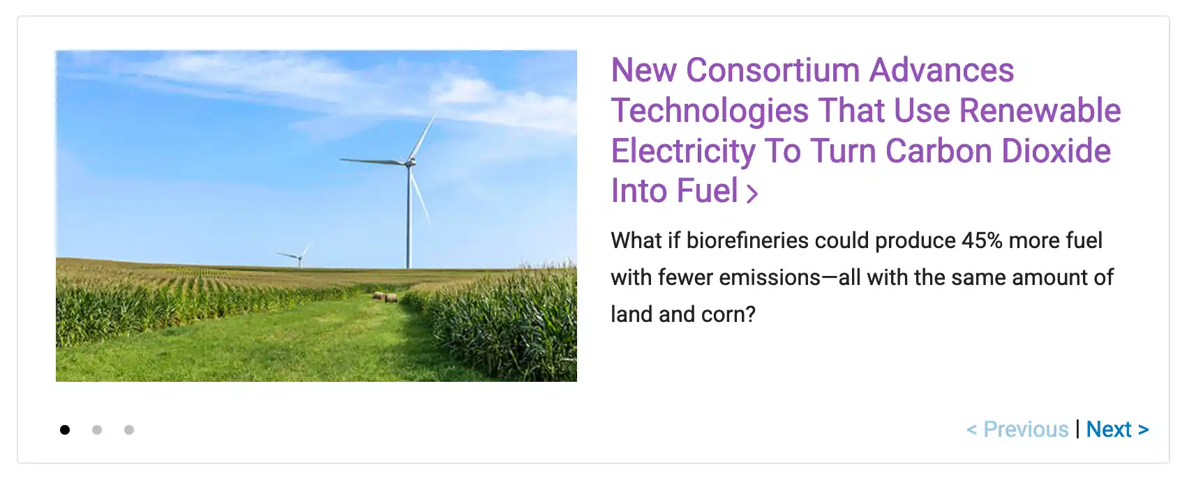
Half of the carousel frame is an image with text on the other side.
Gov Cards
Share

Last Updated Nov. 17, 2026